PX vs. REM vs. EM: Which CSS Unit Should You Use?
Every CSS length you write is a small decision about how your layout responds when the user changes their browser settings. This guide explains how px, rem, and em actually behave, when each one is the right tool, and how to convert between them without a calculator.
Open the PX ↔ REM Converter →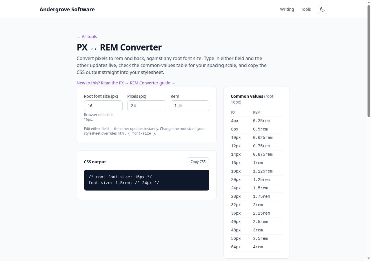
How the three units work
A px is a fixed CSS unit. font-size: 18px renders at the same computed size regardless of what the user has configured as their preferred font size. (It still scales with page zoom and device pixel ratio — px is not a hardware pixel — but it ignores the browser's font-size setting.)
A rem is relative to the root element's font size — the <html> element. In almost every browser the default root size is 16px, so 1rem = 16px, 1.5rem = 24px, and so on. If the user bumps their default font size to 20px, every rem-based length grows proportionally.
An em is relative to the font size of the current element (or, for the font-size property itself, the parent's font size). That makes em powerful for components that should scale with their own text — padding on a button, say — but it also compounds: nested elements that each set font-size: 1.2em multiply together, which is a classic source of mysteriously huge or tiny text.
Why rem is the accessibility default
Browser zoom scales everything, including px values, so it is tempting to conclude the unit choice does not matter. But zoom is not the only mechanism users rely on. Many people set a larger default font size in their browser settings — a persistent preference that applies everywhere without blowing up entire layouts the way 200% zoom does.
That preference changes the root font size, and only font-relative units respond to it. A site built in px simply ignores the user's request. A site built in rem honours it: text, spacing, and containers sized in rem all scale together, and the layout holds. WCAG 1.4.4 requires text to be resizable up to 200% without loss of content or function, and rem-based sizing is the most straightforward way to get there.
The practical rule: use rem for font sizes, and for any spacing or dimension that should grow with the text — line heights (or use unitless), padding around text, max-widths of reading columns, and media query breakpoints.
When px is still the right choice
Not everything should scale with text. Borders are the clearest case: a 1px border is a visual hairline, and turning it into 0.0625rem buys you nothing except a fuzzier value. The same logic applies to box shadows, outline widths, and fixed-size decorative details.
Icons are a judgement call. An icon sitting inline with text usually looks best sized in em or rem so it grows with the words next to it; a standalone toolbar icon can reasonably stay in px.
What you should avoid is px for font-size itself and for the spacing that gives text room to breathe. Those are exactly the values users need to scale.
The 62.5% trick — and its trade-offs
Because 16 is an awkward base for mental arithmetic, a popular pattern sets the root size to 62.5%:
html { font-size: 62.5%; }  /* 1rem = 10px */
body { font-size: 1.6rem; } /* 16px */
Now 2.4rem is 24px and the math is trivial. It works, and it preserves user scaling because the root is still a percentage of the user's preference rather than a fixed px value.
The trade-offs: every third-party component or CSS framework that assumes 1rem = 16px will render at 62.5% of its intended size until you compensate, and any element that misses an explicit font-size falls back to unreadable 10px-equivalent text. Most teams today skip the trick and let a converter (or a design-token system) handle the arithmetic instead.
Converting between px and rem
The formulas are simple:
rem = px / root-font-size
px  = rem x root-font-size
With the default 16px root: 4px = 0.25rem, 8px = 0.5rem, 12px = 0.75rem, 16px = 1rem, 24px = 1.5rem, 32px = 2rem, 48px = 3rem, 64px = 4rem. Design systems tend to standardise on a scale like this (it is Tailwind's spacing scale, among others), which keeps rem values round and predictable.
The converter handles arbitrary values and non-default root sizes — useful when you inherit a codebase using the 62.5% pattern, where the divisor is 10 rather than 16.
Rem in media queries
Breakpoints written in em or rem respond to the user's font-size preference; px breakpoints do not. A user with a 20px default font size effectively has less horizontal space per line of text, and an em-based breakpoint switches to the narrow layout sooner — usually exactly what you want.
One quirk worth knowing: inside media queries, both em and rem are resolved against the initial font size (the browser/user default), not against anything your stylesheet sets on html. That means the 62.5% trick does not change your breakpoint math, and em vs. rem in media queries behave identically. Convention favours em there: @media (min-width: 48em) for a 768px-at-default breakpoint.
Ready to try it? Open the PX ↔ REM Converter →