How to Optimize Images for the Web: the Order of Operations That Matters
Images are the heaviest thing on most pages, and most of that weight is unforced error: a 4,000-pixel photo squeezed into a 400-pixel slot, shipped in the wrong format at the wrong quality. Optimization is a short pipeline whose order matters more than any single setting. Here’s the workflow; the image compressor & resizer runs every step of it locally in your browser.
Open the Image Compressor & Resizer →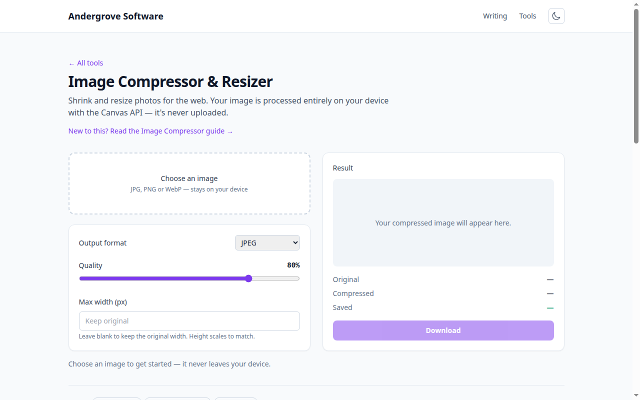
Step 1: resize first — it’s 90% of the win
A camera photo is easily 4,000+ pixels wide; almost no layout displays more than 1,600. Resizing to the actual display size (double it for high-density screens) routinely cuts file size by a factor of five to ten before any compression choice is made — no quality slider comes close. The order matters: resize then compress, because compressing first spends bytes encoding detail the resize immediately throws away. Rule of thumb: content images at 800–1,600 px wide, thumbnails at exactly their slot × 2.
Step 2: pick the format for the job
Photos want lossy formats (WebP, or JPEG for maximum compatibility); flat graphics, screenshots and anything needing transparency want PNG or lossless WebP; and logos or icons are usually better as SVG — text that scales, not pixels at all. WebP typically lands 25–35% smaller than an equivalent JPEG, and every current browser reads it. The full decision flow, including where AVIF fits, is in WebP vs. JPEG vs. PNG — the practical takeaway is that "photograph → lossy, graphics → lossless" prevents both classic mistakes (fuzzy screenshots in JPEG, gigantic photos in PNG).
Step 3: compress to the sweet spot, judged by eye
Lossy quality settings have a knee in the curve: for JPEG and WebP, quality 75–85 is where files shrink dramatically while artifacts stay invisible at normal viewing size. Below ~70, ringing and blockiness creep into edges and gradients; above ~90 you pay double the bytes for differences no one can see. Compress, then look at the result at 100% zoom — actual eyes on the actual image beats any universal number, and the compressor’s live before/after size readout makes the trade explicit. Bonus: re-encoding also strips EXIF metadata — camera model, timestamps and often GPS coordinates — which is bytes saved and privacy gained in the same pass.
Step 4: ship it right — srcset, lazy loading, dimensions
Three HTML habits finish the job. srcset lets the browser pick from several widths, so phones stop downloading desktop images (export 2–3 sizes of your hero images; it’s the highest-value use of responsive images). loading="lazy" on below-the-fold images defers them until scroll — but never on the hero image, which should load immediately since it’s usually the page’s Largest Contentful Paint. And always set width/height attributes so the browser reserves space and the page doesn’t jump as images arrive — that jump is the layout-shift metric search engines now grade you on.
A checklist you can run in two minutes
For each image on the page: is it displayed smaller than its file dimensions (resize it)? Is a photo in PNG or a screenshot in JPEG (switch format)? Is quality above 85 (lower it)? Missing width/height attributes (add them)? Below the fold without lazy loading (add it)? Five questions catch nearly everything, and on a typical unoptimized page they halve the total weight — which shows up directly in load time, bounce rate and search ranking. Run the resize-and-compress steps in the image compressor; your originals never leave the machine.
Ready to try it? Open the Image Compressor & Resizer →