How to Check Color Contrast for Accessibility (WCAG AA and AAA)
If text does not stand out enough from its background, people with low vision — and anyone in bright sunlight — cannot read it, and your site fails accessibility guidelines. Contrast is measurable, and the fix is usually a small tweak. This guide explains the WCAG ratios and how to hit them; check any pair live in the colour converter and contrast checker.
Open the Color Picker & Converter →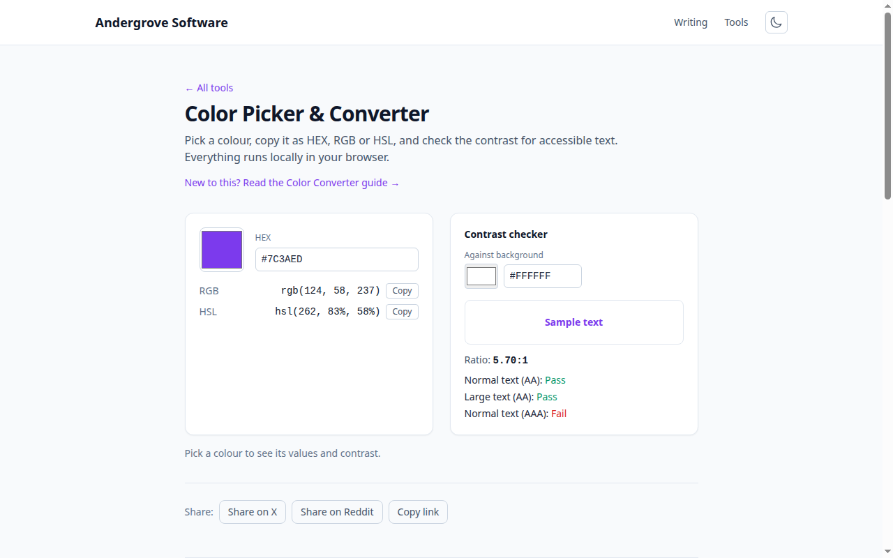
What contrast ratio means
Contrast is expressed as a ratio between the lighter and darker colour's relative luminance — how much light each appears to emit. It runs from 1:1 (identical colours, invisible) to 21:1 (pure black on pure white). The higher the number, the easier the text is to read. WCAG, the Web Content Accessibility Guidelines, sets minimum ratios for text depending on its size and the conformance level you are targeting.
The thresholds to hit
| Content | AA (minimum) | AAA (enhanced) |
|---|---|---|
| Normal text (under ~18px / 14px bold) | 4.5:1 | 7:1 |
| Large text (~18px+ / 14px+ bold) | 3:1 | 4.5:1 |
| UI components & graphics (borders, icons) | 3:1 | — |
AA is the level most laws and policies require; AAA is a stricter target for content that must be maximally legible. Note that larger text is allowed a lower ratio because size compensates for contrast.
How the ratio is calculated
You do not need to do this by hand, but it helps to know why some pairs surprise you. Each colour's channels are converted to relative luminance (a weighted sum that counts green as far brighter than blue), and the ratio is (L_lighter + 0.05) / (L_darker + 0.05). Because luminance is weighted by how the eye perceives each channel, two colours that look similarly "medium" can have very different luminance — which is why a mid-grey on mid-blue can fail even though both feel like middling tones.
Fixing a failing combination
When a pair falls short, you rarely need to abandon the colour — adjust its lightness. Working in HSL (see how CSS colour formats work) makes this easy: darken the text or lighten the background a few percent until the ratio clears the threshold. Other reliable fixes: increase the font size or weight (which lowers the required ratio from 4.5:1 to 3:1), or add a subtle text shadow or overlay behind text on a busy image. Avoid relying on colour alone to convey meaning — pair it with an icon or underline for links.
A note on placeholder and disabled text
Low-contrast grey placeholder text is one of the most common accessibility failures, precisely because designers dim it on purpose. Placeholder text still needs to meet contrast requirements if it conveys information; better still, use a visible label instead of relying on the placeholder. Genuinely disabled controls are exempt, but do not use "disabled" styling for text that users are meant to read.
Check any pair instantly
Paste or pick a foreground and background in the colour converter and it shows the exact contrast ratio and whether the pair passes AA and AAA for normal and large text — plus HEX/RGB/HSL conversions so you can nudge the lightness and re-check in seconds. It all runs in your browser.
Ready to try it? Open the Color Picker & Converter →